HighScope Educational Research Foundation · Industry Project · EdTech
Streamlining Complex Workflows for HighScope's LMS
Tools
Figma, Canva, Heuristic Evaluation, Pen & Paper
Team
1 UX Designer (Me)
Stakeholders
1 Product Manager (Educator), 1 Project Lead, 4 Developers
Duration
5 Months
Context & Overview
HighScope Educational Research Foundation, a leader in early childhood education, was transitioning from a third-party LMS tool to an in-house platform.
However, initial usability tests revealed critical navigation challenges, workflow inefficiencies, and an unfriendly gradebook interface — leading to confusion, increased task time, and frustration among administrators, facilitators, and students.
Key Outcomes
Improved Navigation, Role-Specific Workflows, Optimised Gradebook Design
My Role
As a UX Consultant working remotely, I conducted expert usability testing, streamlined complex workflows, and refined screen layouts.
Deliverables
Information Architectures & 40+ Mid-fidelity Wireframes
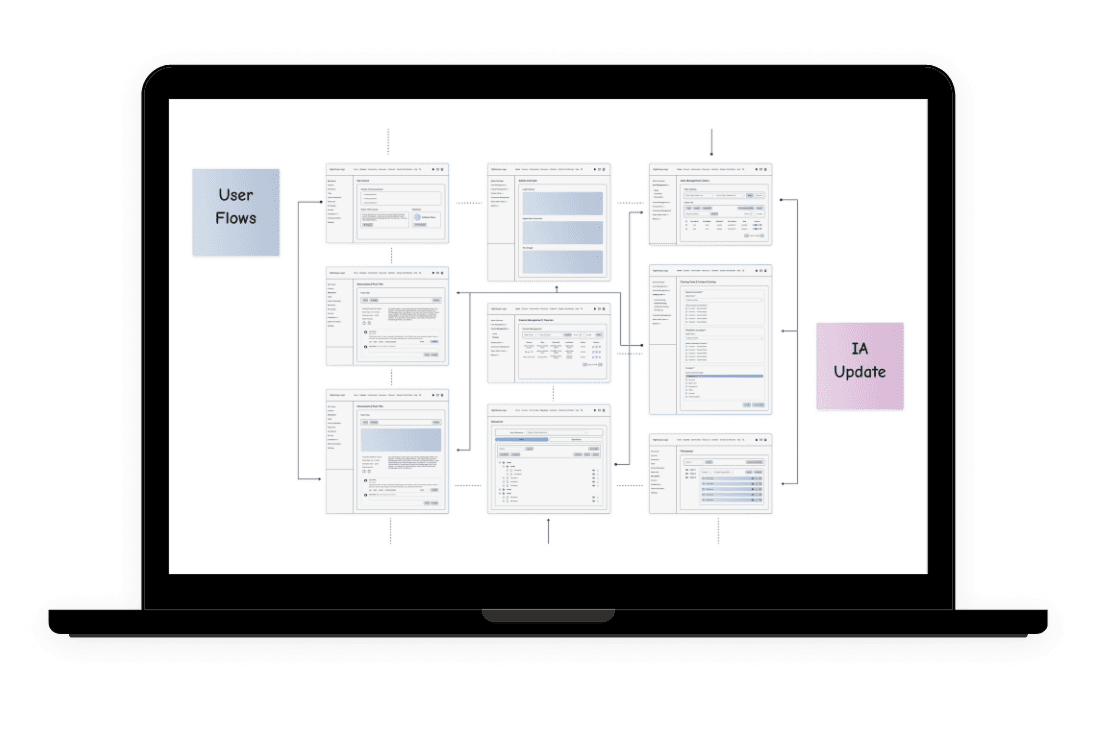
Streamlining Complex Navigation & Workflows
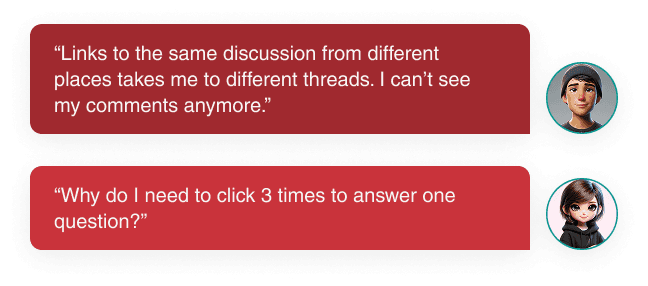
The incomplete flow of information and limited details in the existing information architecture led to redundancy (e.g., multiple threads for the same discussion post) and additional clicks (e.g., multiple clicks in the quizzes).
Overhauling of the Information Architecture, Iteratively Adding & Refining Details
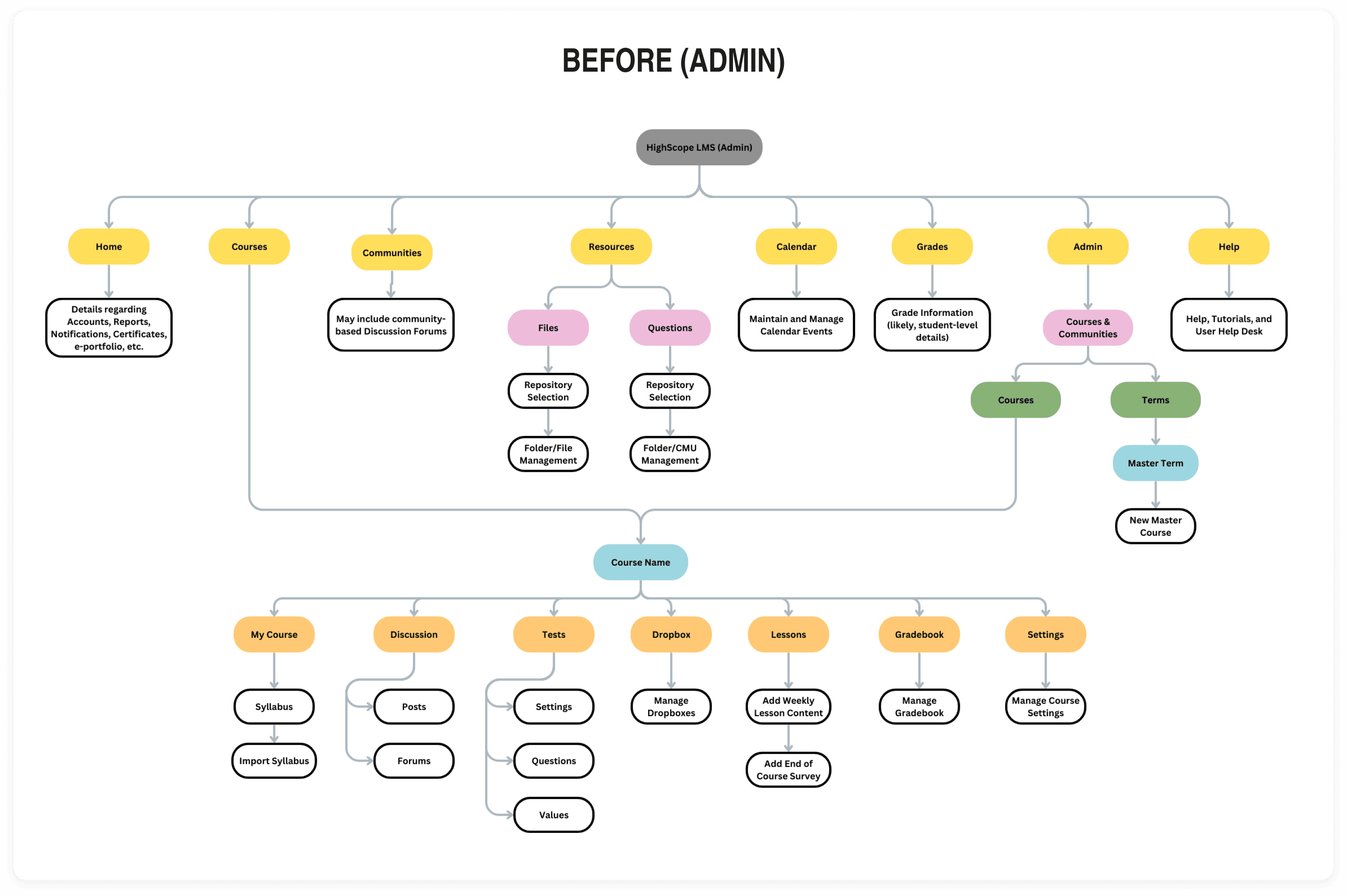
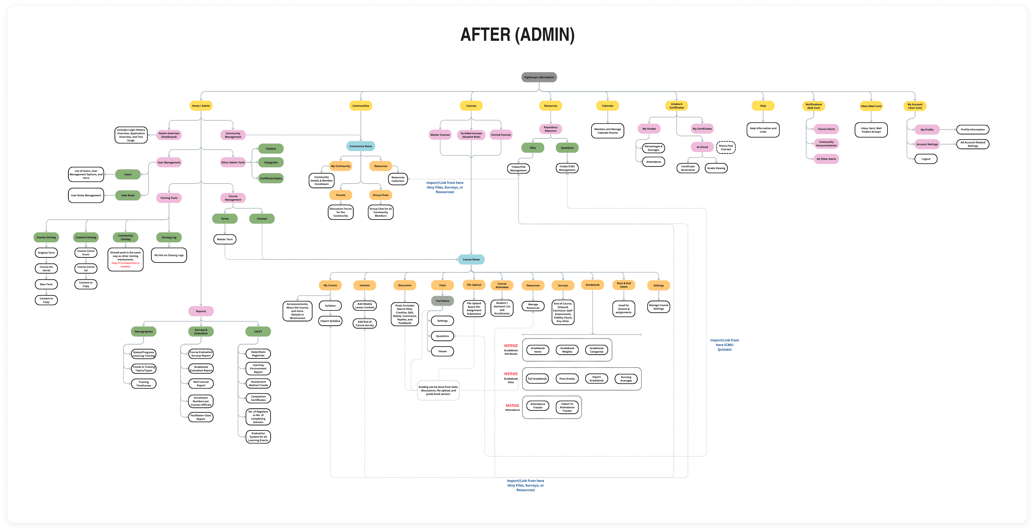
Impact After Overhaul
✅ Reduced redundancy by improving clarity in information flow.
✅ Decreased the number of clicks by refining the architecture.
✅ Facilitated efficient development by distinguishing mutually exclusive & connected modules inside the LMS.
Improvements in Action (Example: Quizzes)
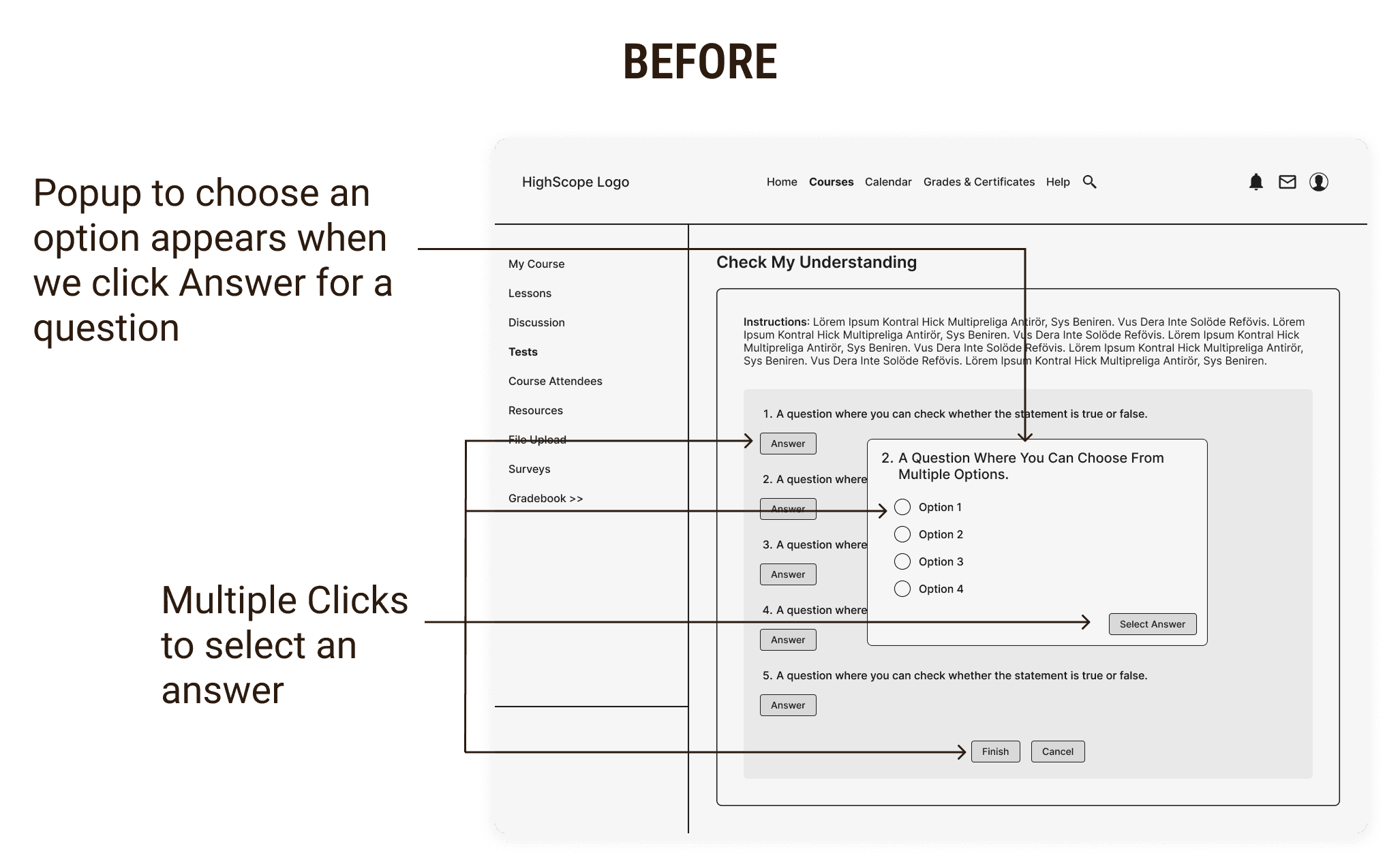
❌ 3 clicks to select an answer.
❌ Cannot modify answer after clicking Select Answer.
❌ Extra time to complete the task.
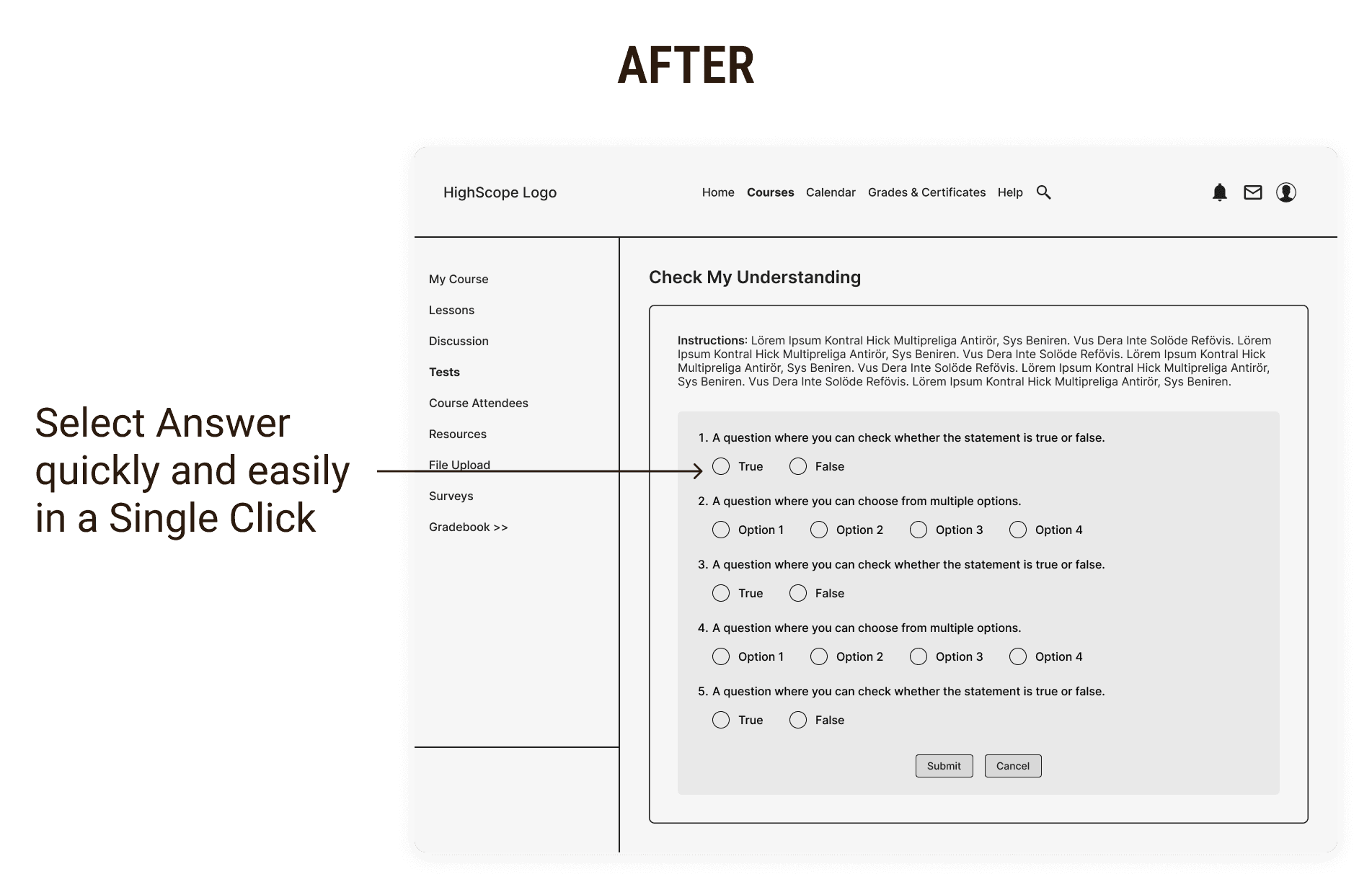
✅ Just 1 click to select an answer.
✅ Modify answers as many times until you click on Submit Test.
✅ Quick and Effective task completion.
Redesigning an Efficient Gradebook Experience
Original Design: Endless Bi-directional Scrolling
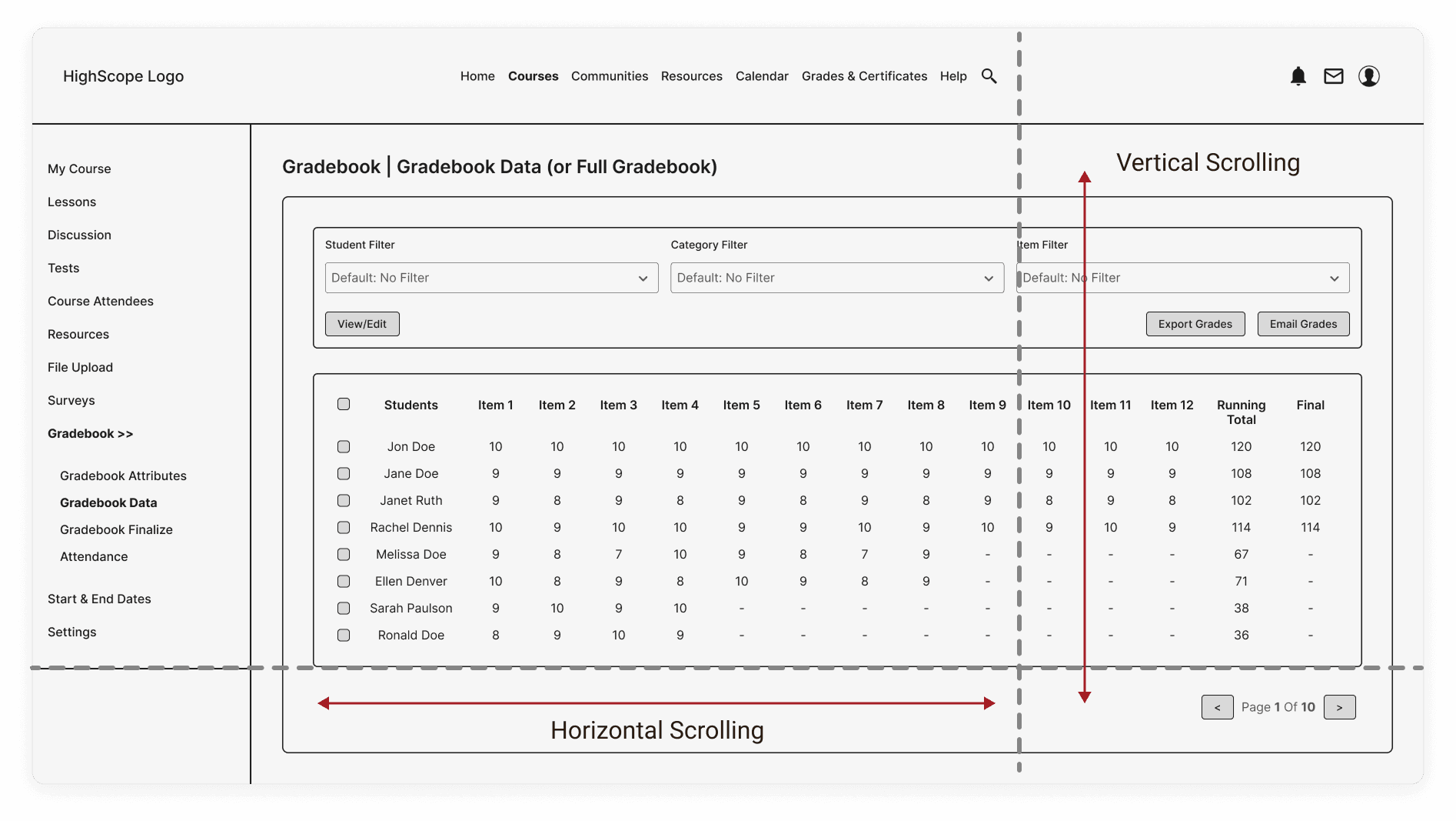
❌ Bidirectional scrolling is time-consuming and inconvenient for users.
❌ Filters allow only a single selection, resulting in additional effort to fill and compare grades.
Revamped Design: Simplified Layout & Reduced Scrolling Requirements
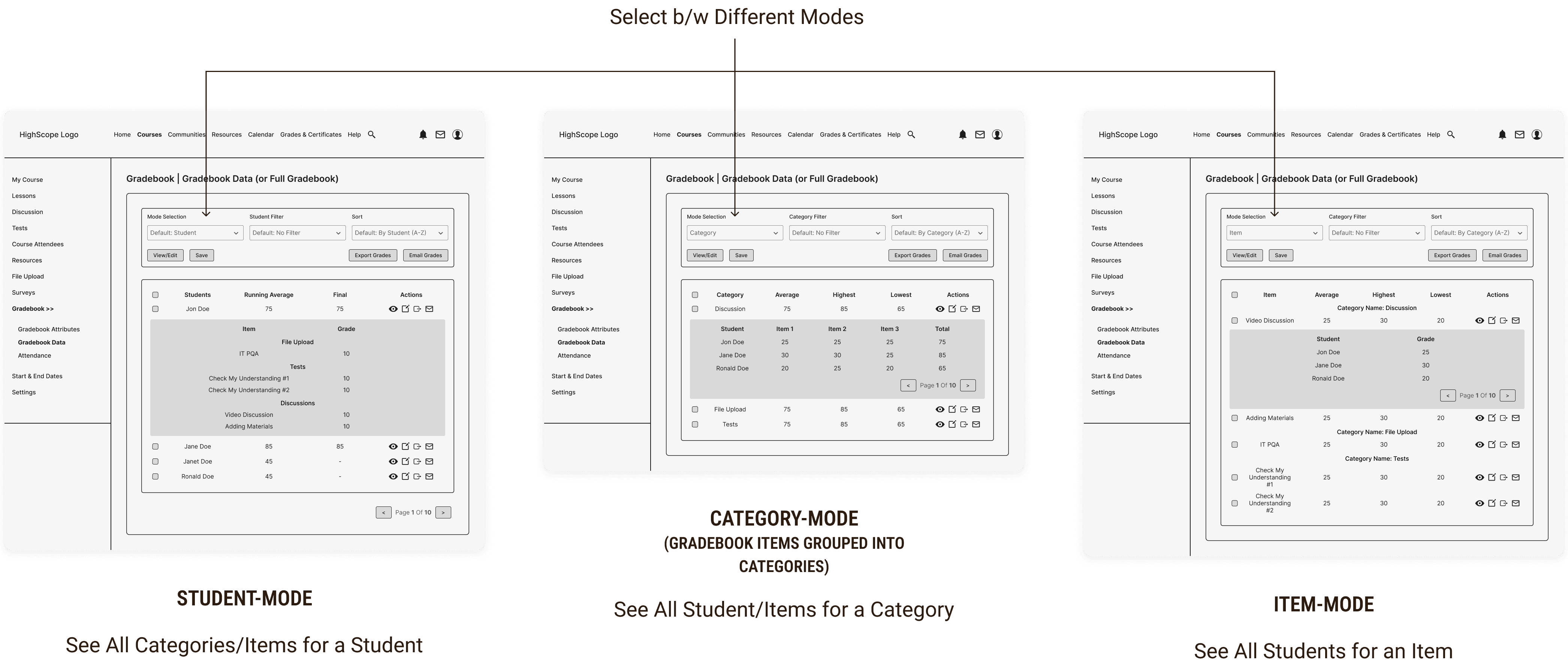
✅ Reduced scrolling to a single direction for easier navigation.
✅ Enabled 3 flexible viewing modes for efficient access to gradebook data.
✅ Improved filters with multi-selection options for better usability.
❌ Technical Constraint: The redesigned gradebook requires extended development time, exceeding project timelines.
Balancing Usability with Feasibility
I collaborated closely with stakeholders and developers, iterating until we reached an optimized design that met both user needs and technical constraints.
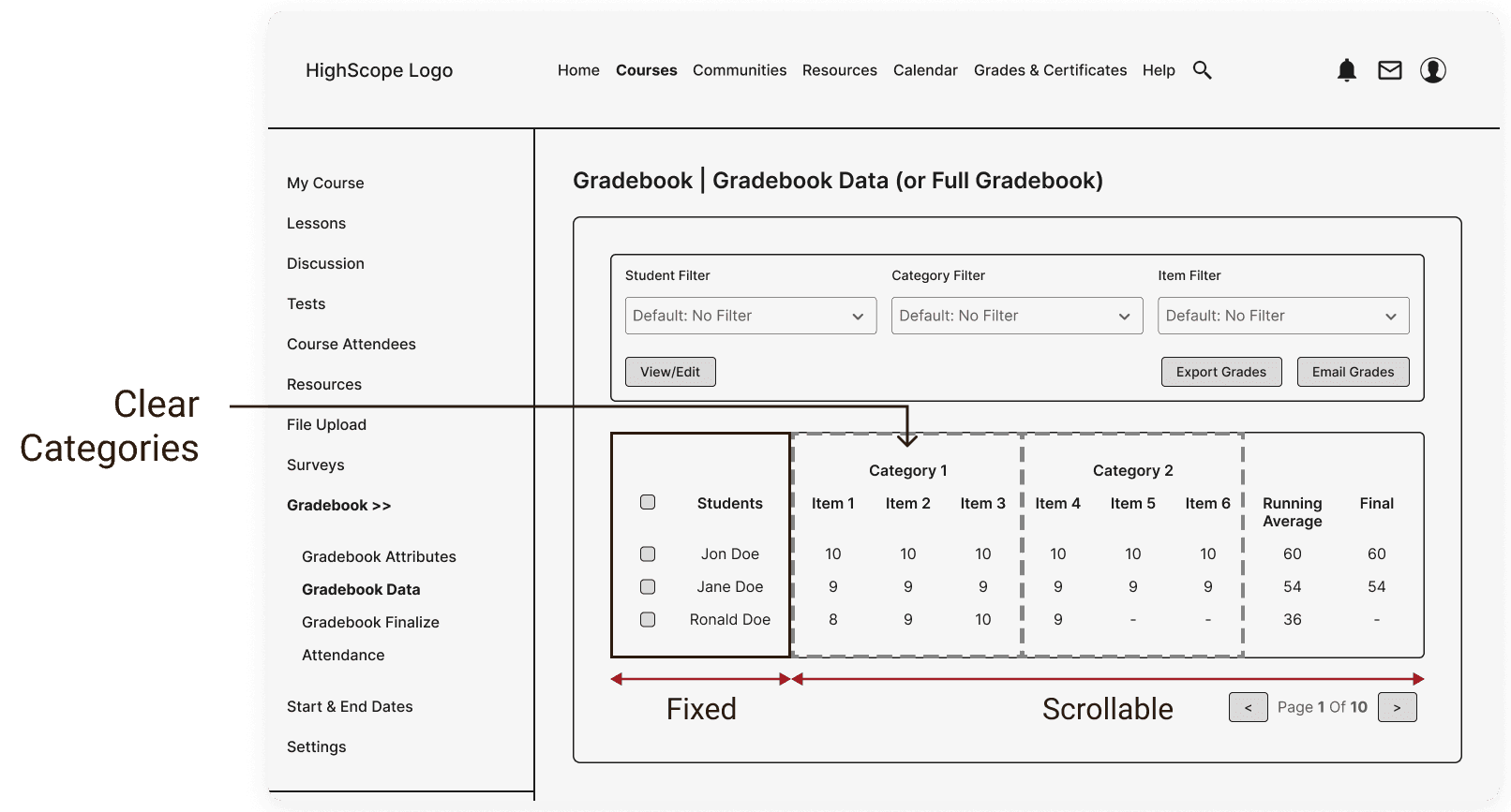
✅ Fixed student names to limit horizontal scrolling.
✅ Added category headers for better clarity.
✅ Enhanced filters with multi-selection capability.
✅ Optimized design to improve usability while reducing development time.
Final Outcomes & Key Learnings
✅ Reduced total no. of clicks by 15-20% across the WebApp.
✅ Decreased scrolling effort in the Gradebook by 10-12%.
✅ Improved navigation clarity and differentiated between role-based features & permissions.