
2024-25 · HighScope · Industry Project · B2B · EdTech
Enhanced Learning Experience for Students & Teachers by Redesigning a Learning Management System (LMS)


Students and teachers were slowed down by confusing navigation and excessive scrolling, making key tasks harder than necessary. The core problem was an unclear information architecture with redundant steps and modules, which also caused repeated developer rework.
By simplifying the information architecture, reducing steps in student flows, improving the gradebook layout, and adding clearer annotations for developers, I created a smoother experience, faster workflows, and better alignment across the team.
My Role
UX/UI Designer (Solo)
Stakeholders
1 Product Manager
1 Educator
4 Engineers
Key Outcomes
Faster Task Completion
Simpler Navigation
Less Rework
Deliverables
Information Architectures
50+ Wireframes
Key User Problem
Students and teachers are slowed down due to tricky navigation and heavy scrolling.
Issue #1
Hard-to-find Actions
Users missed important buttons amidst redundant information, and struggled to complete essential tasks.
+
Issue #2
Cluttered Layouts
Dense information and two-directional scrolling made scanning, filling, and comparing data difficult.
User Impact
Slowed Learning Experience
Higher task time, frequent mistakes, and overall frustration—leading to inefficient learning experiences.
Root Cause
A UX audit revealed redundant steps and modules, unclear information heirarchy, and dense information layouts that confused users and increased rework for developers.
Impact on Business
"Inefficient tool workflows and constant development rework slowed releases and reduced adoption, ultimately limiting business growth."
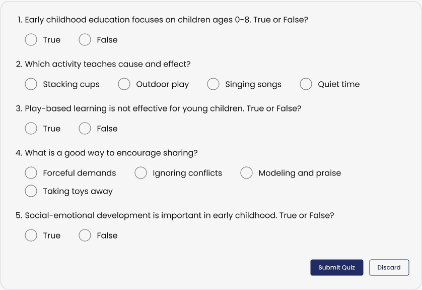
Design Decision 001: Simpler User Flows (Example: Student Quiz Experience)
Minimised unnecessary steps for students, allowing more time for actual learning.
Flow Before Redesigning
Click Answer → Select an Option → Click Select Answer → Repeat for All Questions → Click Finish → Task Complete
Issues
3 clicks to select an answer.
Cannot modify the answer after clicking Select Answer.
Time consuming task.

Flow After Redesigning
Select an Option → Repeat for All Questions → Click Submit Quiz → Task Complete
Improvements
Just 1 click to select an answer.
Modify answers as many times until you click on Submit Test.
Quick and Effective task completion.
Student Impact
Students can now spend more time reflecting on their knowledge and answering questions than managing the logistics of the process.
Design Decision 002: Clearer Information Structure (Example: Teacher Gradebook Experience)
Provided faster and easier gradebook management for teachers by reducing clutter and redundancies.
Information Structure Before Redesigning
The original Gradebook listed features with poor information hierarchy and clarity, causing developers to misinterpret related functions as separate pages.
Issues
Redundant pages and features.
Unclear distinction between gradebook setup and evaluation.
More errors, increased task time and teacher frustration.

Information Structure After Redesigning
The revised structure removes redundancies and groups related features under a clear hierarchy, making the Gradebook easier to understand and navigate.
Improvements
No redundancies
Clear distinction between gradebook setup and evaluation.
Less errors, reduced task time and teacher frustration

Teacher Impact
By removing clutter and grouping related grade details, teachers now spend less time managing the Gradebook, and more time teaching and evaluating.
Development Impact
A clearer information hierarchy gave developers clarity on module intent, which resulted in faster and more accurate implementation.
Design Decision 003: Cleaner Layouts (Example: Teacher Gradebook Experience)
Restricted horizontal scrolling and improved gradebook layout, allowing teachers to grade faster with less errors.
Before: Error-prone & Time-intensive Grading
Teachers struggled to scan and enter grades because the table required heavy horizontal scrolling, causing delays and selection errors.
Strategic Challenge
Timeline and engineering constraints ruled out a full rebuild. I needed low-effort layout fixes that delivered fast, measurable wins.
Layout Issues
Student names disappear on scrolling.
Excessive horizontal scrolling due to hidden columns.
Poor use of button for 'View/Edit' toggle.
Too many primary buttons made layout dense.
Layout Improvements
Fixed Student names column.
Category details and filter to reduce columns as per need.
Changed 'View/Edit' button to toggle switch.
Added conditional secondary buttons for a cleaner layout.
After: Faster, More Efficient Grading
Teachers now grade with less scrolling and fewer data-entry errors — improving speed and confidence.
Strategic Impact
Delivered visible UX gains with minimal engineering effort — reduced dev rework and aligned stakeholders on a feasible rollout.
Bonus: Dev-friendly Collaboration (Example: Lesson Building Experience)
Accelerated handoff with fewer questions by adding dev-friendly annotations.

Overall Impact
Better Outcomes: Faster learning, quicker grading, less rework
Student Impact
Students now spend learning the content rather than understanding how to use the Learning Management System.
Teacher Impact
Teachers now grade with less scrolling and fewer data-entry errors — improving speed and confidence.
Business & Stakeholder Impact